OAKSUN STUDIO
Visual experience without sacrificing performance
2025
SERVICES
- Web Design
- Development
- Visual Identity
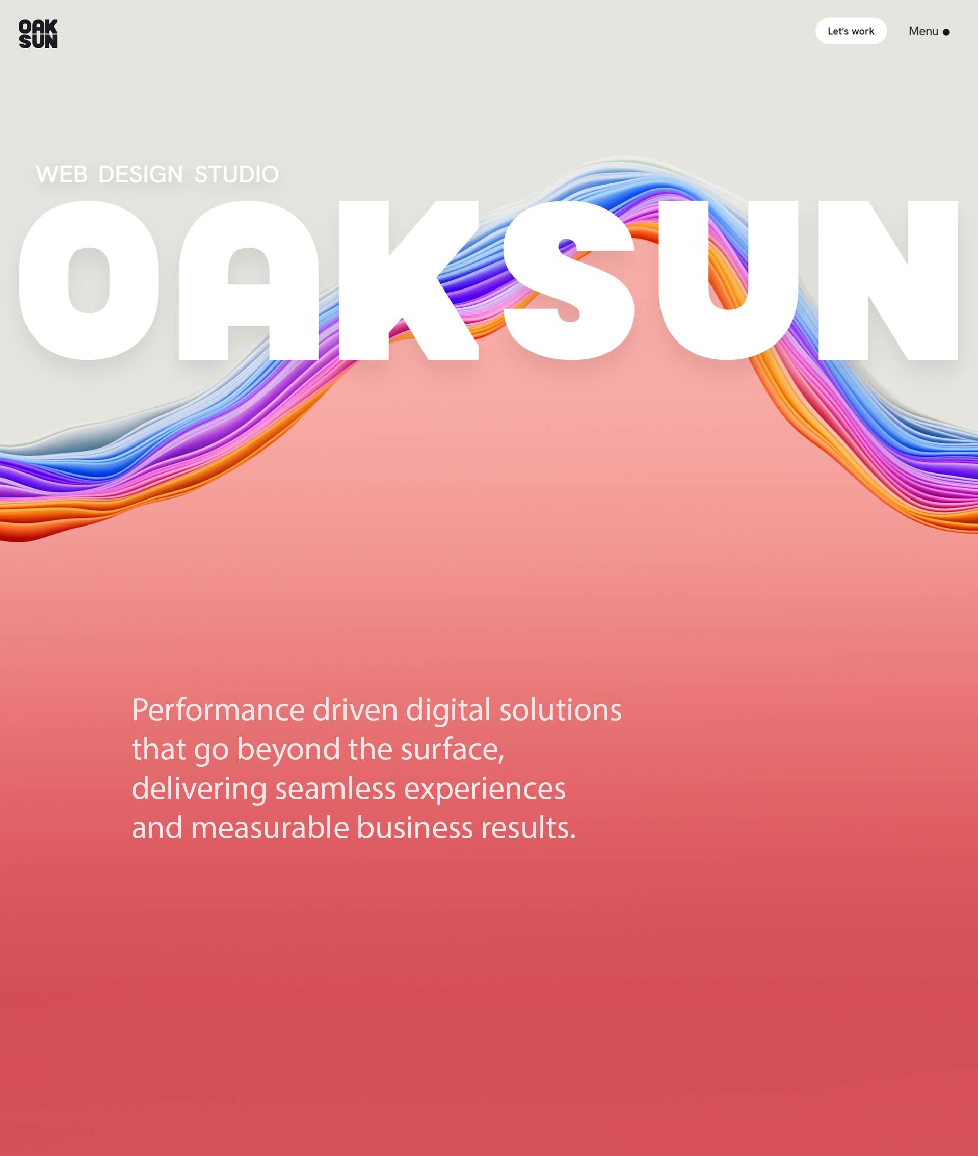
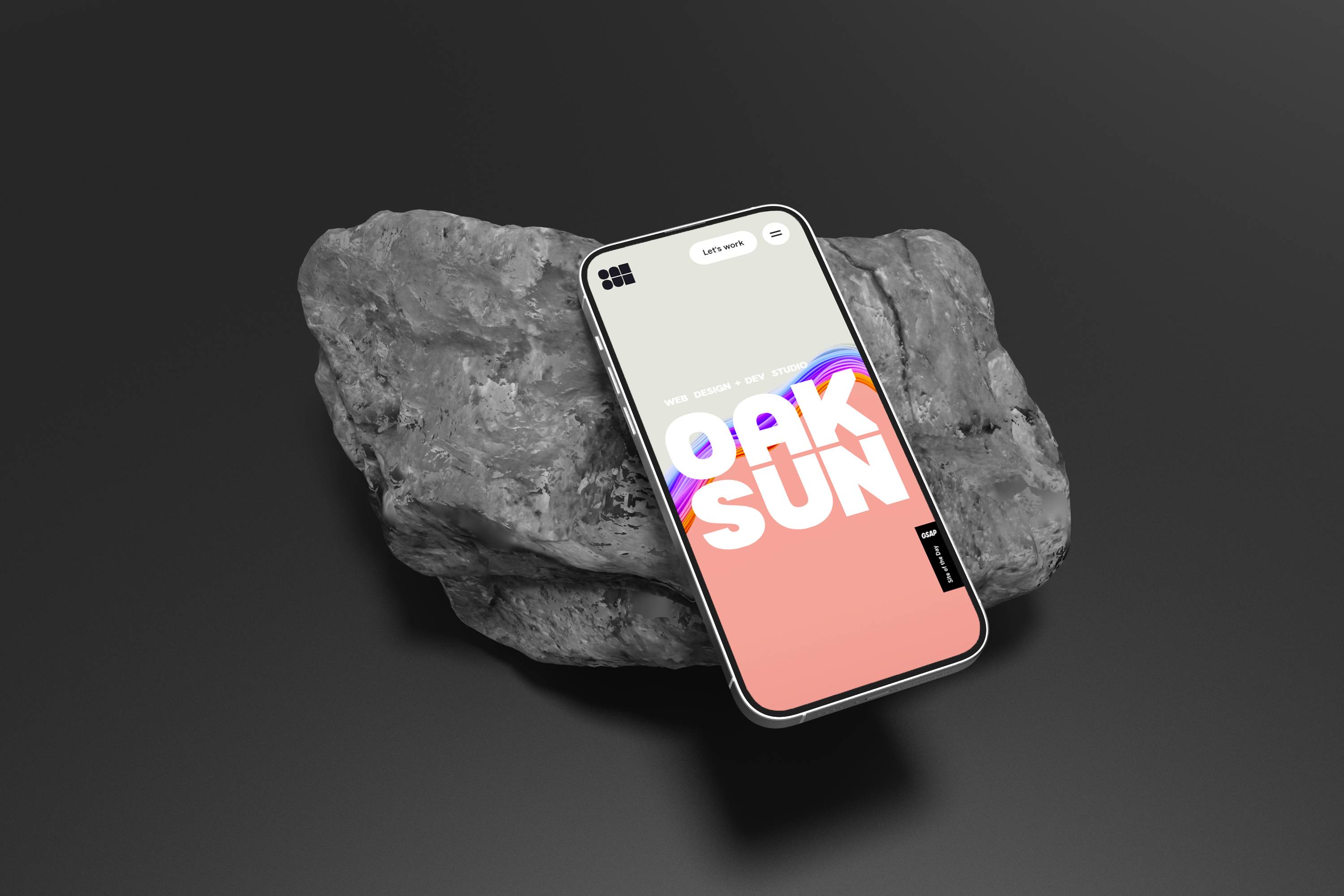
OAKSUN is a newly launched web design and development studio, crafted to showcase expertise in creating fun and performant digital experiences. The brand identity reflects modern, minimalist design principles.
This website serves as both a digital presence and a showcase of capabilities, featuring a seamless blend of design and performance.


Logo Design
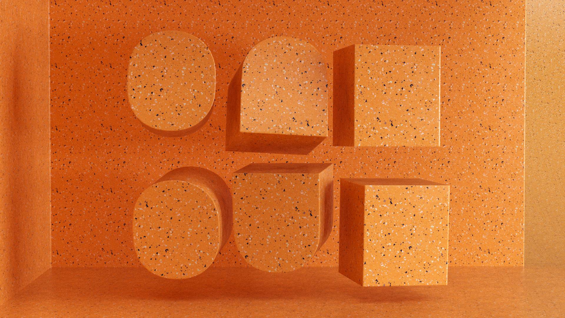
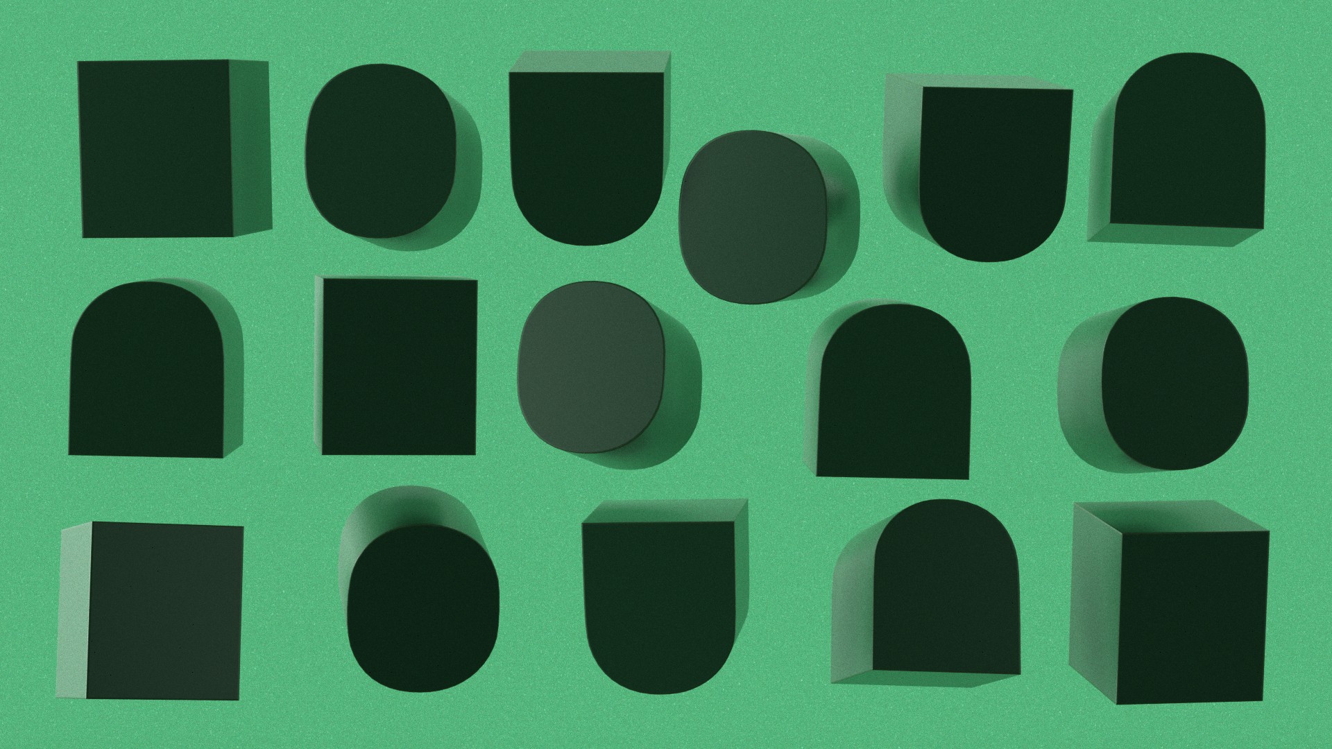
The OAKSUN logo is constructed from three fundamental geometric shapes: a rounded square, an arch, and a rectangle. These elemental forms combine to create a modular grid system that represents structured yet creative approach to digital design. These three geometric primitives serve as building blocks throughout the brand identity, transforming into dynamic patterns and layouts. The modular nature of these shapes reflects a systematic approach to problem-solving, while their arrangement creates a visual rhythm that speaks to balance of form and function.
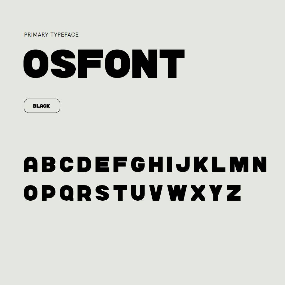
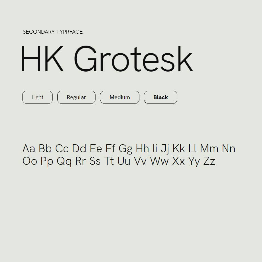
The primary typeface is OSFONT, a custom-designed font that echoes the geometric principles of the logo design. Built from the same fundamental shapes - rounded squares, arches, and rectangles - it creates a cohesive visual language throughout the brand. HK Grotesk serves as the secondary typeface, chosen for its excellent legibility and modern geometric construction, perfectly complementing the primary font while ensuring optimal readability across digital platforms.


Work Hard, Play Harder
404 pages don't have to be boring. This retro Space Invaders-style game transforms error messages into an entertaining challenge. Got a broken link? Take a break to blast some invaders and rack up a high score while you're at it.

